Limiara UI foundations
Status: Initial light-theme foundation for issue #96
Visual source: Selected People workspace direction
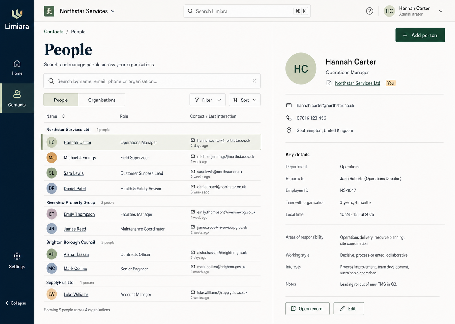
These foundations translate the selected warm editorial direction into a small set of reusable, accessible primitives. They are intentionally host-level rather than Contacts-specific so plugin-contributed interfaces inherit the same visual language and interaction contract.
Token model
Tokens live in apps/web/src/styles/tokens.css. Components consume semantic tokens such as --surface-canvas, --text-secondary, --border-selected, --action-primary-hover, and --focus-ring; feature code should not use palette values directly.
The current light theme covers:
- canvas, subtle, raised, selected, disabled, success, warning, and danger surfaces;
- primary, secondary, muted, disabled, link, warning, danger, and on-accent text;
- subtle, default, strong, selected, and danger borders;
- primary, hover, active, secondary-hover, and destructive action states;
- typography, spacing, radii, borders, elevation, control sizing, focus, and motion.
The palette uses warm chalk surfaces, deep ink text, forest actions, sage selection, and restrained amber/red feedback. Semantic aliases form the theming contract for the later user-selectable colour schemes tracked in #106.
Typography
Display headings use a platform serif stack to retain the selected direction’s editorial hierarchy without adding a render-blocking font request. Product UI, controls, and body copy use the platform sans-serif stack. No screen should introduce a third product type family.
Primitive contract
The initial primitives are exported from apps/web/src/components/ui:
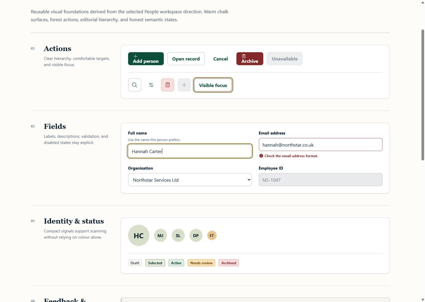
ButtonandIconButtonprovide hierarchy, loading, disabled, destructive, and labelled icon-only actions.TextFieldandSelectassociate labels, descriptions, validation state, and error text with their controls.Badgeexpresses neutral, selected, success, warning, and danger states using text as well as colour.Avatarprovides deterministic initials when no image is supplied and preserves an accessible name.Alertuses assertive announcement only for danger; informational, success, and warning feedback use status semantics.EmptyStategives a clear explanation and optional next action without adding dashboard-card chrome.Skeletonexposes one named loading status while keeping its visual lines hidden from assistive technology.
Product icons come from @phosphor-icons/react. Use the regular outline family for normal actions and filled status icons where faster recognition helps. Do not add emoji, text glyphs, or hand-drawn SVG icons.
Accessibility rules
- Keyboard focus uses a high-contrast amber ring with an offset that remains visible on light and forest surfaces.
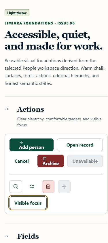
- Interactive targets are at least 44px for standard and icon controls; the explicitly compact button remains 36px for secondary inline use.
- Disabled state changes text, surface, border, and cursor rather than opacity alone.
- Errors and statuses include text and icon cues; colour is never the only signal.
- Motion tokens collapse to 1ms and skeleton/spinner animations stop under
prefers-reduced-motion: reduce. - Forced-colour mode delegates controls to system colours while preserving visible focus.
Review the states
Run the web development server and open /__ui. The showcase is only rendered in Vite development mode; production builds continue to render the application demonstration.
Representative evidence: desktop showcase and mobile showcase.